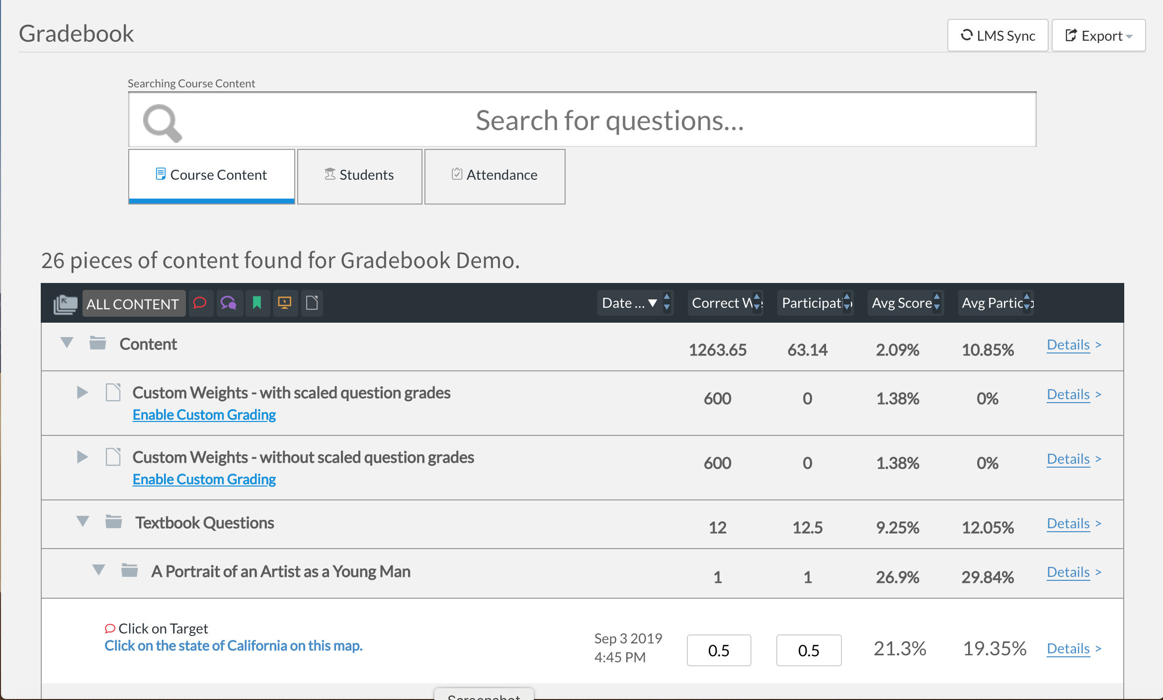
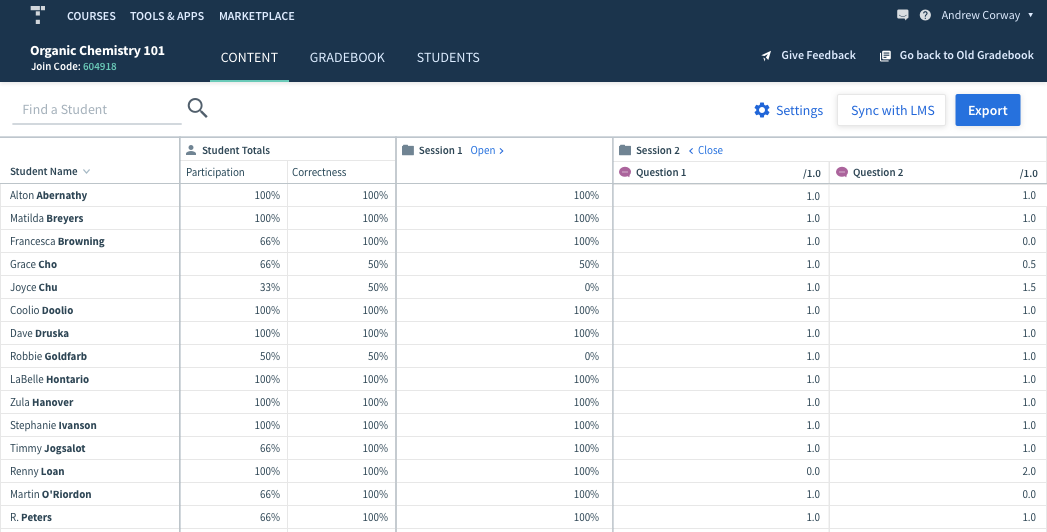
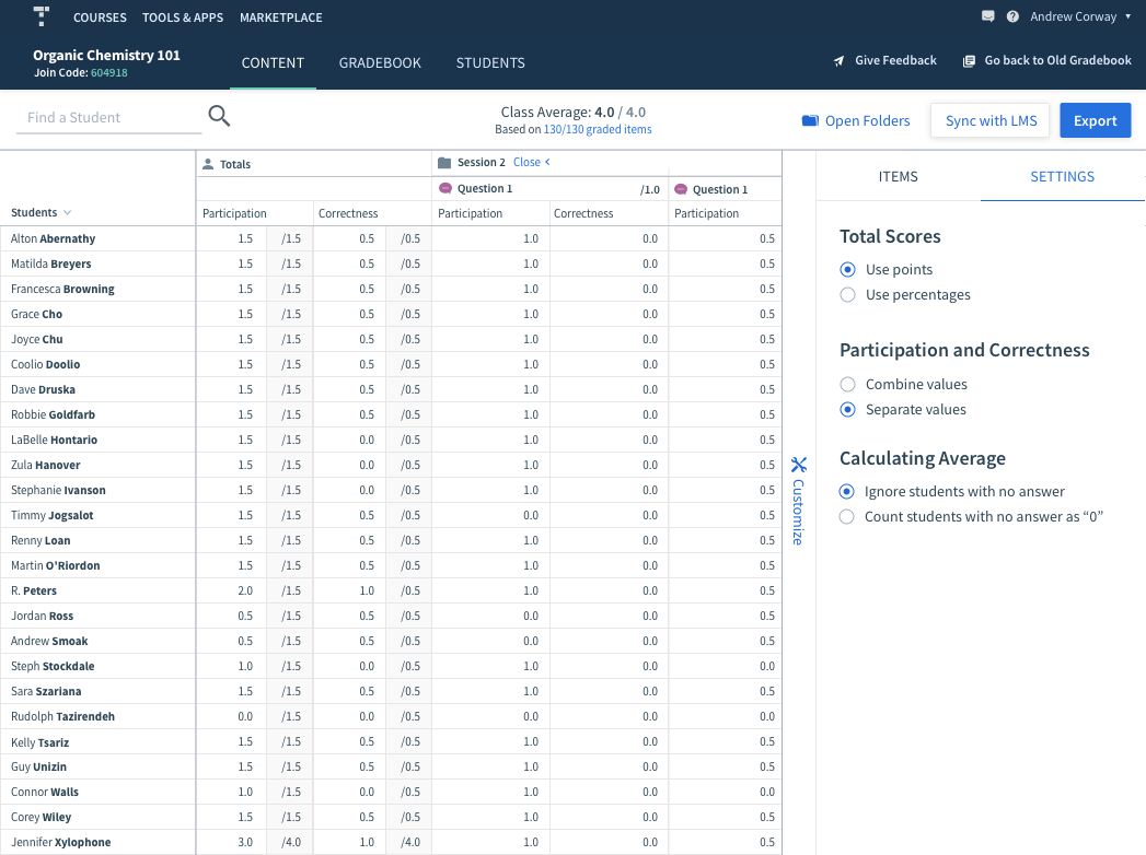
Top Hat Gradebook

Top Hat is a teaching platform for university professors. Their gradebook is a key component which allows them evaluate student grades and make neccessary adjustments.Our engineering team had delivered an new grading platform, yet professors still preferred the old version.

The Challenge

Learn what professors want, then design and implement gradebook features that provide more value than the old gradebook. Success is measured by the number of users willing to switch.

My Role

Senior Product Designer
Working with product, research, customer support and engineering.

Out with the old ..

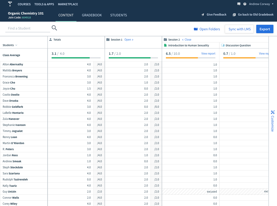
The profs we interviewed confirmed they preferred the new design, but it did not have the robust feature set of the old.

Our analysis showed a growing body of "switchers", users moving back and forth between the two versions. The key to our success would be convincing the switchers to stay on the new platform.

Understanding the user journey

With oversight from volunteer profs and customer support, I mapped the timeline of an individual course. It revealed two key periods where we could make a big impact by addressing three crucial pain points:

Solution sketches

New gradebook was a clean slate, where would all these features go? I used solution sketches to map out potential components we could add to the gradebook.

This was a quick, easy, and collaborative way to work with the team. It helped us prioritize features and assess our appetite for solutions.

Editing grades, and our first component

The first pain point to tackle was the most basic function of the gradebook - finding and editing grades.

Since the format of the new gradebook was so different, new components had to be developed. Reusing these components would speed up work for the team and create familiar patterns for our users.

The toolbar component

With some wins under our belt, it was time to undertake a bigger challenge. We learned that professors would export their data to a spreadsheet and then remove certain assignments to recalculate student grades.

Our "Customize" toolbar was designed to give them this ability live in the app. This was a huge time saver for professors and won us the loyalty of many switchers.

Averages and analysis

We had one major challenge to clear: analysis of student data. Adding a row of averages helped the professors track student performance across various assignments. But our diehard users were not going to switch without surfacing a more detailed analysis.

To address this group, I designed a report view allowing professors to "zoom in" on individual assignments and students. The new UI allowed us to incorporate more details and bulk editing features that made grading faster.

Success!

Once we launched the report views for questions and students, we saw a tremendous uptick in users switching to our new UX.

Feedback and interviews confirmed that the new gradebook had reached the level of sophistication and depth our users were looking for. Top Hat was able to formally deprecate the old gradebook and concentrate solely on the new platform.