The ideal customer experience
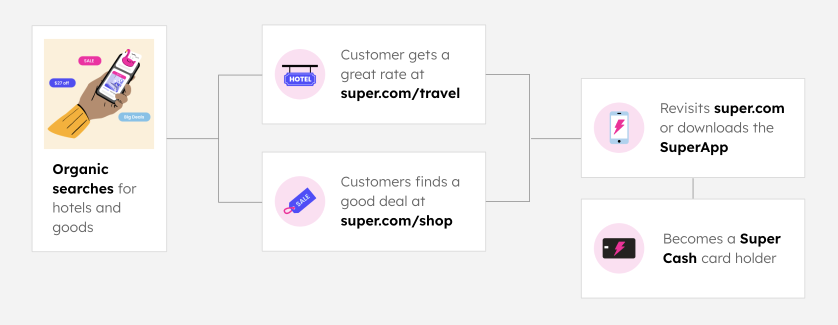
Super made money through organic traffic discovering their travel and shop sites. The hope was to steer shoppers into downloading an app that contained more value, and get customers excited about the SuperCash card.
My Role: Director of Product Design and Research
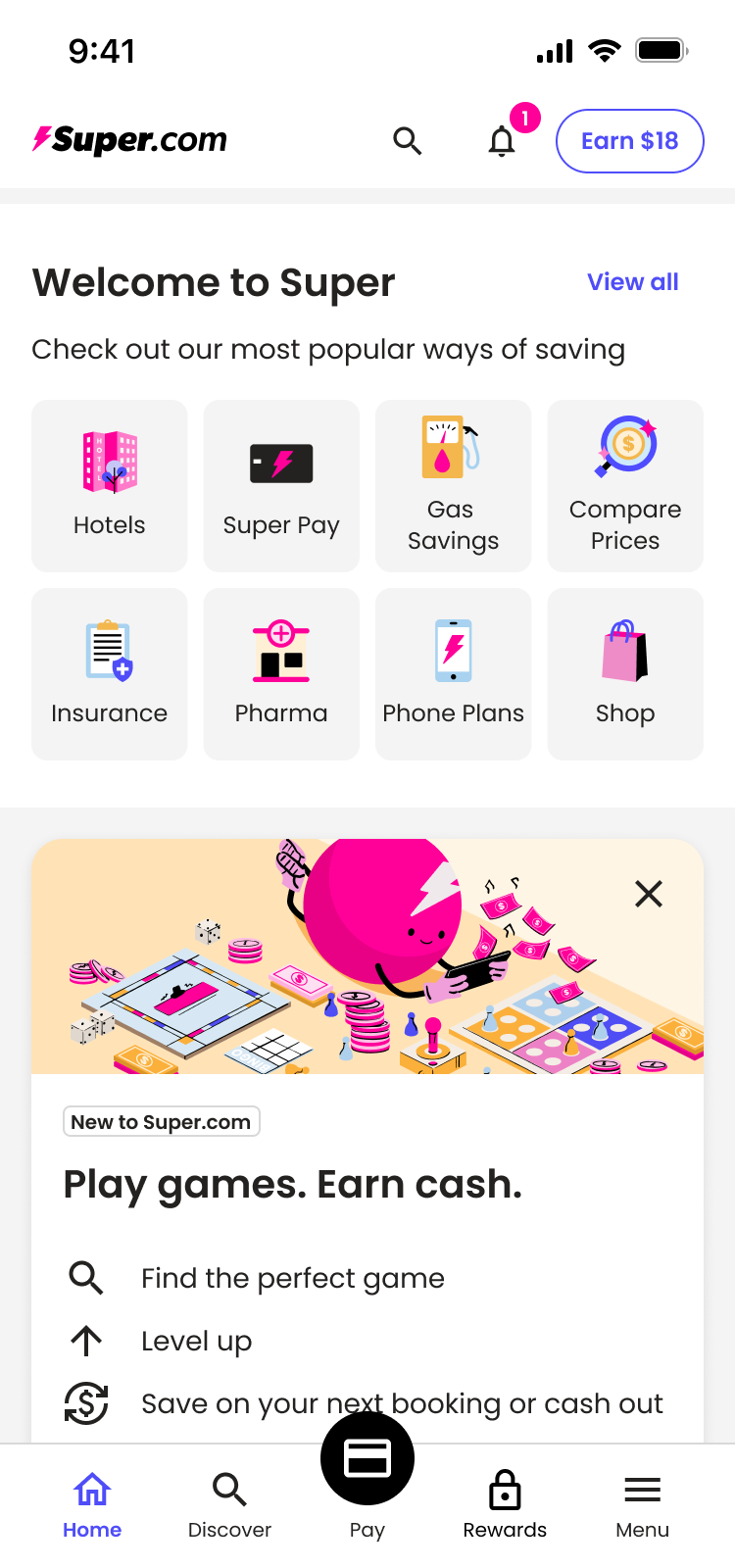
Super was an "all in one savings solution" offering deals on travel and goods as well as their new SuperCash card. The issue was - all three of these offerings were built as separate apps.
Super made money through organic traffic discovering their travel and shop sites. The hope was to steer shoppers into downloading an app that contained more value, and get customers excited about the SuperCash card.
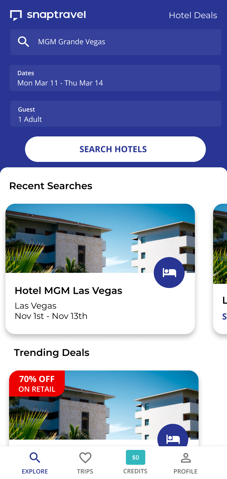
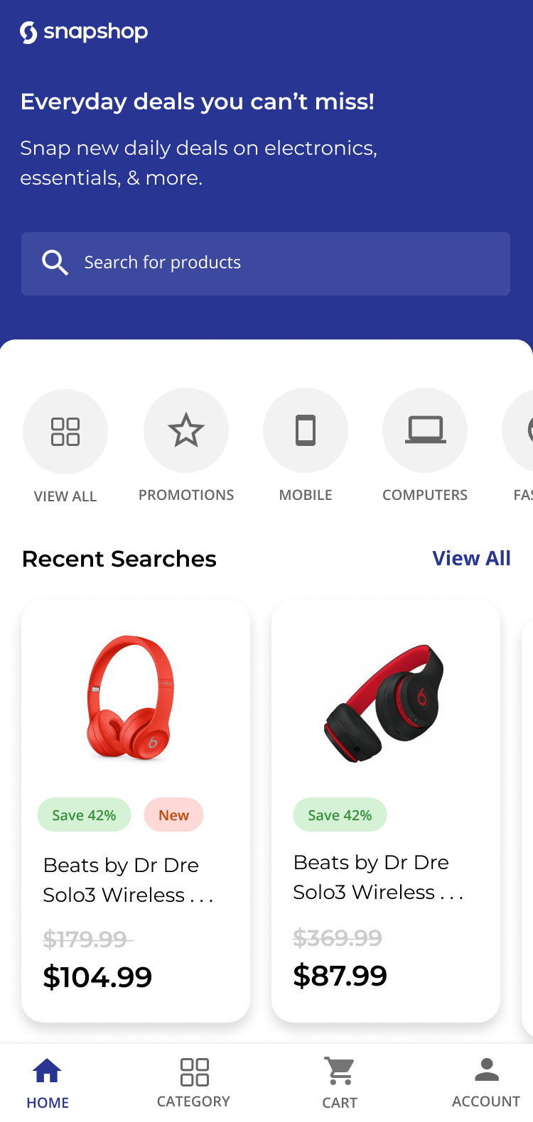
Super's travel offering was already available in the app store. Their shop was a web-based ecommerce platform. The SuperCash card was housed in a newly created standalone app.
Our mission was to consolidate these three apps into one cohesive experience.
Each designer on my team was responsible for a different section of the app. Working together, we merged them into our initial MVP. We needed to make some significant tradeoffs in order to launch quickly, but we also made a commitment to learn from our customers and make continuous improvements.
Reorganizing the app and adopting a new brand identity gave us the perfect opportunity to introduce a design system that harmonized styling and components across the UX.
I led a time-boxed team of designers and engineers to establish the design system in Figma and Storybook. We then introduced KRs for the various teams to implement the new components across the app.
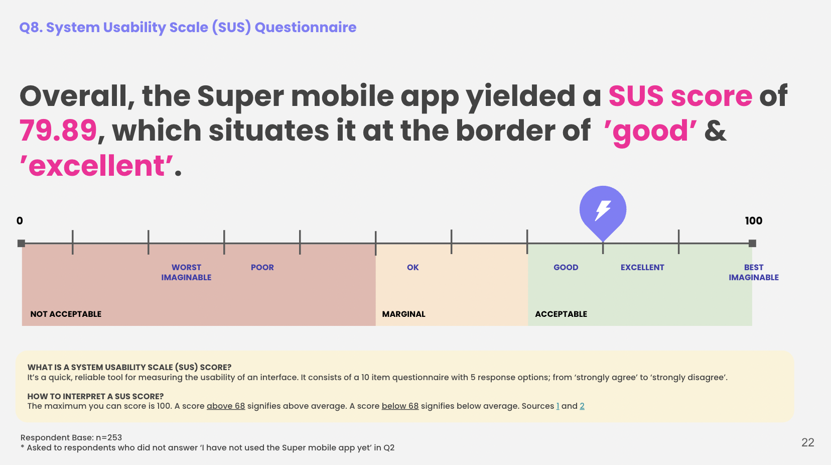
Through unmoderated user testing, we sought to understand how users were navigating our app and have them grade us based on a system usability scale (SUS). As we suspected, our initial MVP scored poorly.
The test recordings revealed a lot of key usability issues and points of confusion for our users.
We set a KR to improve the score and began issuing recommendations to gradually overhaul the app.
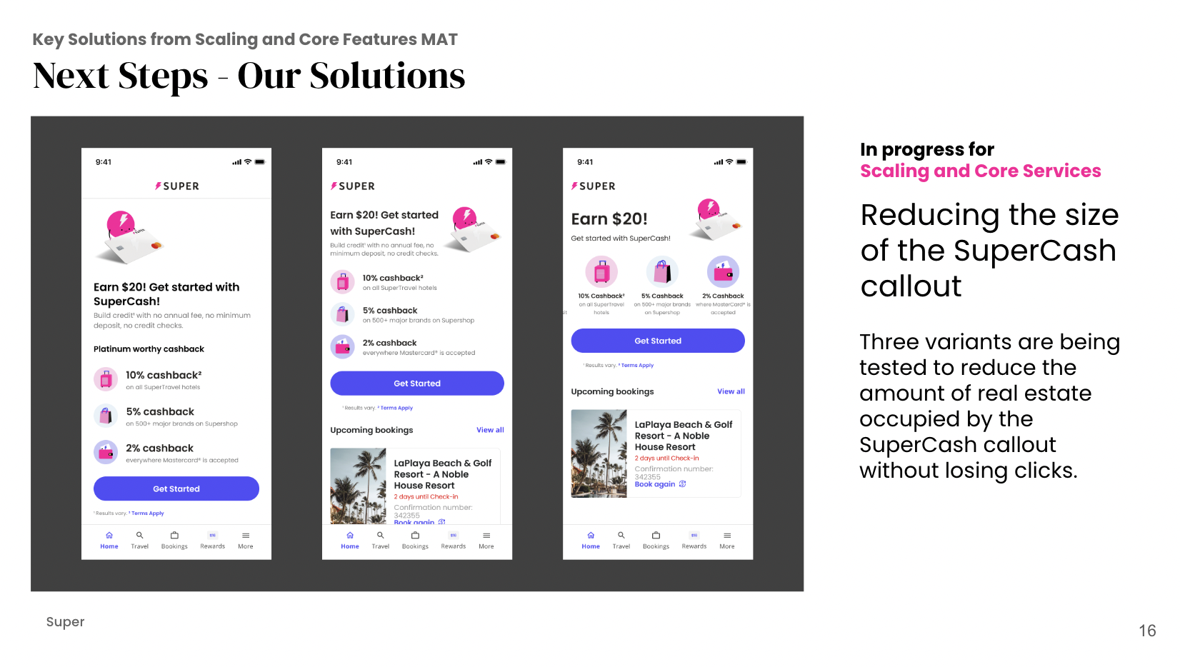
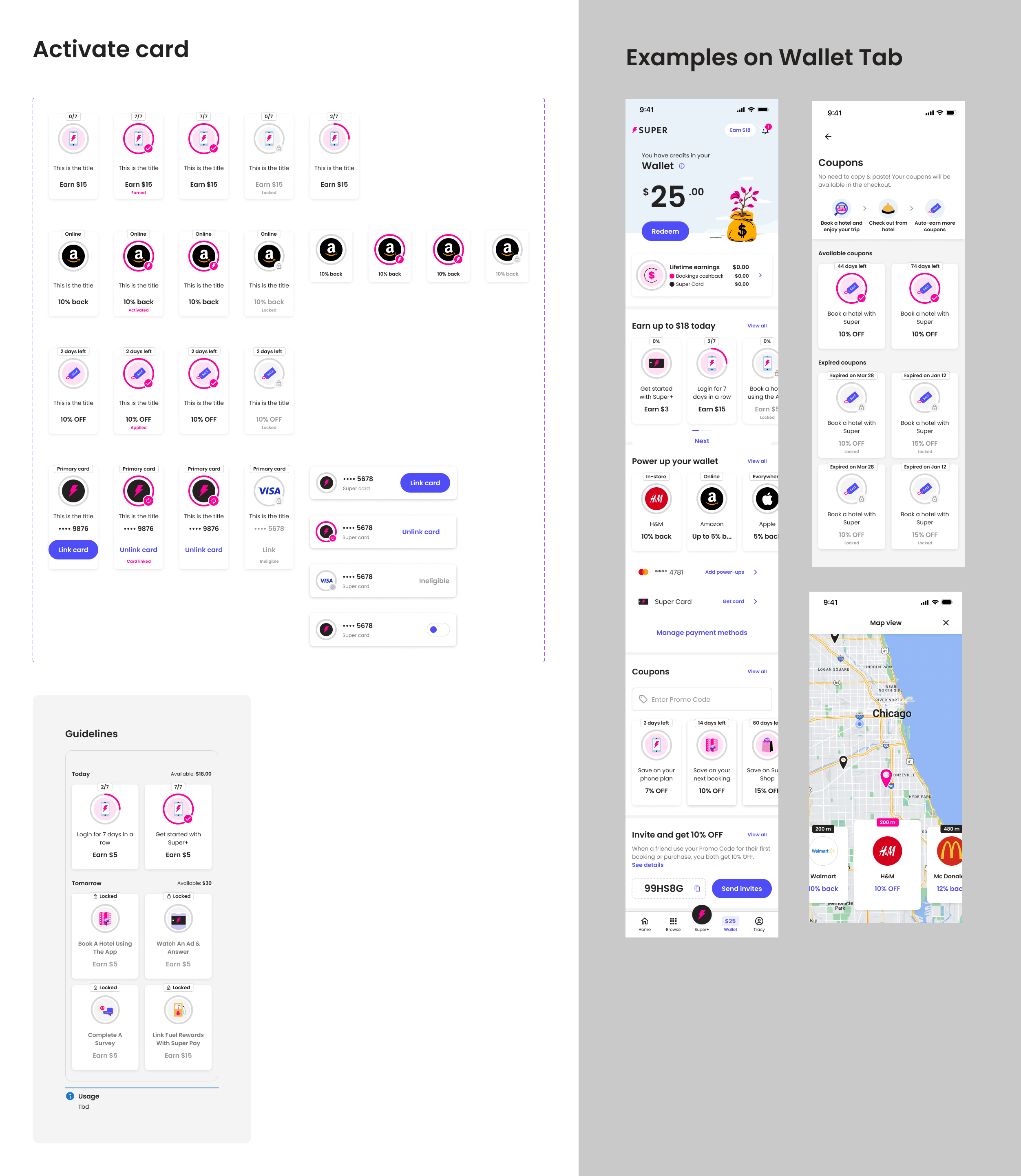
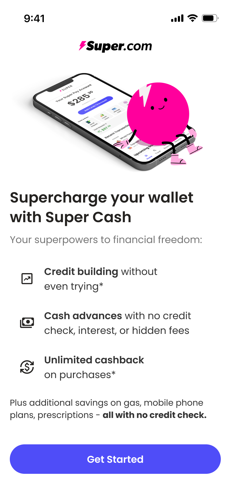
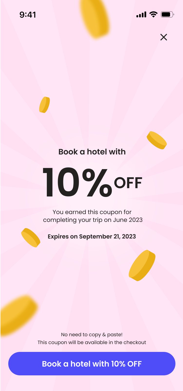
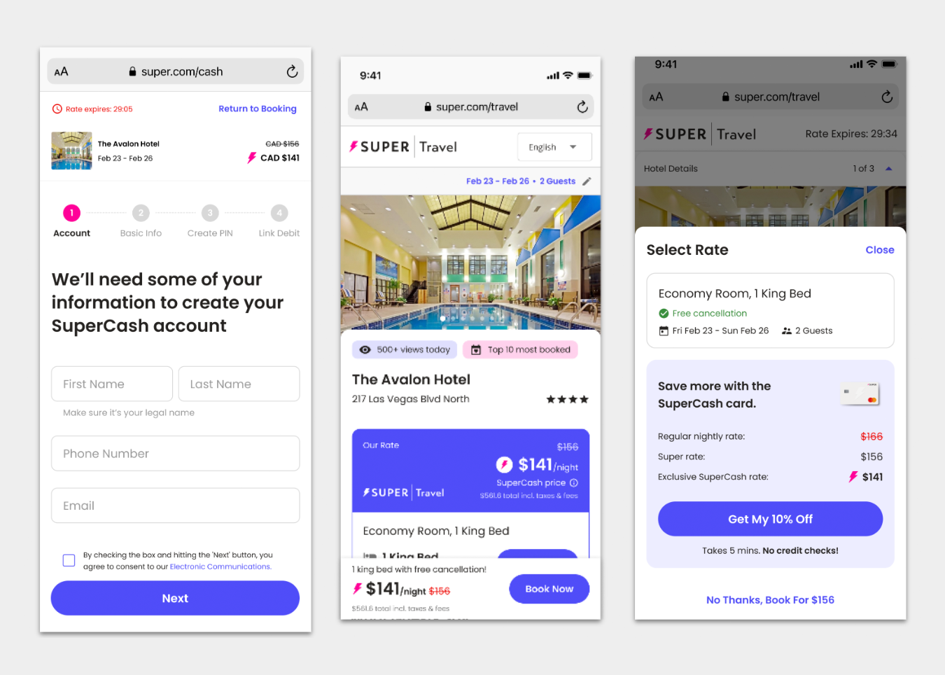
An early compromise involved placing the nascent SuperCash offering on our home page, but as new features were added, it pulled focus from our other business lines. An overhaul of the UX architecture gave us room to expand.
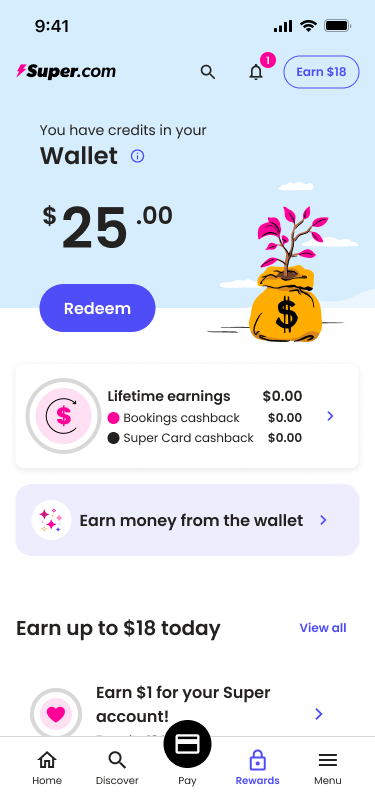
Over the years Super had added many different types of rewards, credits and bonuses. First time users were confused of how to navigate this section.
A rewrite of our rewards structure was in order. Iteration and testing helped create a new experience that users found clear and accessible.
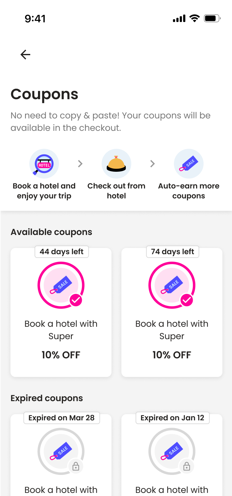
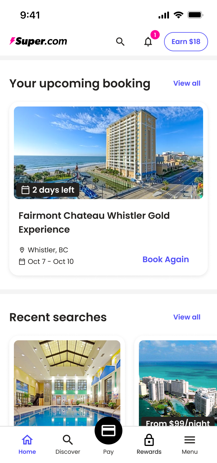
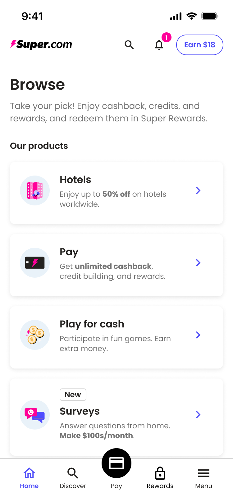
During our tests, many users struggled to find all the app had to offer as many benefits were buried far down the old, static homepage.
Incorporating a browse section and using data profiles to prioritize information created a more navigable experience.
We continued to run our test as we rolled out changes. After one quarter we had logged a jump to 62.14 and after a second quarter we had reached 79.89.
Our improvements correlated with higher rates of customers converting, signing up for SuperCash, and using their new cards. Our test users and customer reps confirmed that the experience was clearer, more cohesive, and inspired trust.
In addition to the positive impacts for our business the implementation of the design system had allowed for faster development with less mistakes. This increased team velocity and allowed us to ship experiments and improvements faster. Thanks design system!